Kraft Mailer Artwork Guide: Print Areas, Ink Colors and Mockup Checks
Kraft mailer artwork prints best as a bold vector logo in one or two high-contrast inks, placed clear of seal flaps, windows and the shipping-label zone. Custom Kraft Mailers adapts your files for brown kraft paper in a free mockup within 24 hours, so you can check placement, color and scale on your exact format before anything is printed.

- Bold vector logos with solid fills print most cleanly on kraft
- Black, white and deep brand colors read best on brown paper
- Keep artwork clear of seal flaps, windows and the label zone
- Free mockup within 24 hours with unlimited free revisions
- Minimum order is 12; production takes about 2 weeks after approval
What artwork actually prints well on a brown kraft mailer?
Bold, simple artwork prints best on kraft mailers: a clean logo, solid shapes, a short line of text and one or two ink colors with strong contrast against brown paper. Kraft is an uncoated, natural-fiber surface, so it absorbs ink more than white coated stock. Fine hairlines, tiny type and soft gradients tend to lose definition, while confident shapes look crisp and intentional.
Think of the brown paper as a color in your palette rather than a blank background. Dark inks such as black, navy and deep green sit on kraft with plenty of contrast. White ink reads well too and gives the mailer a premium, screen-printed feel. Pale tints like light pink or sky blue can look muddy, because the warm brown underneath shifts how they appear.
- Works well: solid logos, wordmarks, simple icons, outlined illustrations with medium-weight lines, short taglines.
- Needs adjustment: photographs, color gradients, drop shadows, very thin script fonts.
- Usually rethought: full-bleed photo designs made for glossy white packaging.
If your brand guide was built for white boxes, Custom Kraft Mailers can adapt it for kraft in the free mockup, so you see the brown-paper version before committing.
Where can you print on a kraft mailer, and does the format change the print area?
The front panel of the kraft mailer is the main print area on every format, and most brands start there with a centered or offset logo. Beyond the front, the usable space depends on the format you choose, because seams, seal strips, padding and windows all affect where ink can land cleanly.
| Format | Main print area | Artwork notes |
|---|---|---|
| Flat kraft mailer | Front panel, with space on the back | Smooth surface suits detailed wordmarks and a back-panel message. |
| Padded kraft mailer | Front panel | Cushioning can soften very fine detail, so favor bold marks. |
| Poly-lined kraft mailer | Front panel | Prints like standard kraft outside; the lining does not change the design. |
| Self-seal kraft mailer | Front panel | Keep artwork clear of the adhesive flap and the tear line. |
| Window kraft mailer | Panel around the window | Design around the opening so the logo frames the product. |
| Large-format kraft mailer | Large front panel | Room for a bigger logo or logo plus tagline without crowding. |
Tell Custom Kraft Mailers which format you want when you send artwork, and the mockup will show your design placed on that exact mailer, flap and window included.
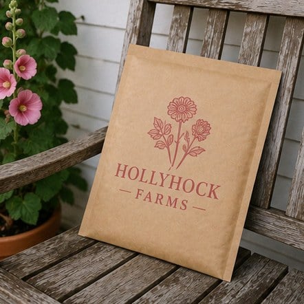
How should you choose ink colors for a kraft mailer design?
Choose ink colors for kraft mailers by testing contrast against brown, not against white. A color that looks vivid on your website can sink into kraft paper, while a darker or more saturated version of the same hue holds its own. The goal is a design that reads from across a doorstep and still looks on-brand up close.
Start with your primary brand color and ask whether it is dark enough to stand out on brown. If it is a light shade, consider printing it as an accent and using black or white for the main logo. Many brands land on a single-color design, which looks deliberate on kraft and keeps the artwork simple.
- Black: the safest choice, sharp and readable on every format.
- White: high contrast and a crafted, upscale look.
- Deep reds, greens and blues: strong brand color that still reads clearly.
- Pastels and light neutrals: test in the mockup before deciding.
When exact color matters, tell the team your brand color reference with the artwork. The mockup from Custom Kraft Mailers shows how the color is planned to sit on kraft, and you can request adjustments with unlimited free revisions.
How do you set up logo artwork so it holds detail on kraft paper?
Set up kraft mailer artwork as a clean vector file with solid fills, medium-to-heavy line weights and type that is not too small to read at arm’s length. Vector artwork scales to any mailer size without blurring, and solid fills give the ink a clear edge on the uncoated surface.
A few setup habits make a visible difference on kraft:
- Convert text to outlines so fonts cannot be substituted during production.
- Thicken hairlines in icons and borders; thin strokes can break up on natural fiber.
- Open up tight letter spacing in small taglines so letters do not merge.
- Remove gradients and shadows or replace them with flat color blocks.
- Simplify reversed-out detail, where brown paper shows through the ink, because small reversed shapes can fill in.
If you only have a flattened image of your logo, send it anyway. Custom Kraft Mailers will flag anything that needs rework in the mockup stage rather than printing a version that looks soft. You pay nothing until you approve the design, so the cleanup happens before any commitment.
What should you put on a kraft mailer besides the logo?
Beyond the logo, the most useful additions to a kraft mailer are a short tagline, your website or social handle, and an optional back-panel message. Each element should earn its place, because a crowded mailer reads as busy on brown paper, while a restrained layout reads as premium.
Ask what the customer needs at the moment the mailer lands. A website or handle helps recipients find you again and invites unboxing posts. A short line on the back, such as a thank-you or a prompt to reuse the mailer, adds personality without competing with the front. Recycling guidance can be useful too, as long as it matches what the mailer can actually do.
- Front: logo, plus a tagline only if it is short.
- Back or flap: website, handle or a brief thank-you line.
- Leave clear space for the shipping label so it never covers the brand mark.
Plan the label zone carefully. Fulfillment teams usually stick labels on the front, so placing the logo off-center or toward one end keeps it visible after packing. The Custom Kraft Mailers mockup can show a label placeholder if you ask.
How do you review a kraft mailer mockup before approving it?
Review a kraft mailer mockup by checking five things in order: spelling, placement, color, scale and format. Custom Kraft Mailers returns a free mockup within 24 hours, and unlimited free revisions mean there is no reason to approve a design you are unsure about. Production of about 2 weeks only starts after you approve.
- Spelling and details: read every word aloud, including the website, handle and tagline.
- Placement: confirm the logo clears the seal flap, window and likely label area.
- Color: compare ink choices against brand guidelines with kraft in mind.
- Scale: picture the mailer held at arm’s length; the logo should read instantly.
- Format: check the mockup shows the exact mailer style and size you plan to ship.
Share the mockup with whoever owns the brand and whoever packs orders. Designers catch color and spacing issues, while fulfillment staff spot label conflicts or flap problems. One combined round of feedback is faster than several separate ones.
Can you use different artwork across kraft mailer formats in one order?
Brands can use different artwork across kraft mailer formats, and a matching family of designs often works better than forcing one layout onto every style. A padded mailer and a large-format mailer have different proportions, so the same logo may need different sizing or placement to look balanced on each.
A simple approach is to keep one master logo and adapt the layout per format: a centered mark on flat mailers, an offset mark on self-seal mailers to avoid the flap, and a logo framing the opening on window mailers. Ink color and typography stay consistent, so customers recognize the brand whichever mailer arrives.
Ask Custom Kraft Mailers for a mockup of each format at once, so you can compare them side by side and approve the whole set together. With a minimum order of 12, testing a second format or a variant design is realistic before a larger rollout, and the artwork files stay ready for later reorders.
Frequently asked questions
Should kraft mailer artwork be designed differently from white box artwork?
Kraft mailer artwork usually needs heavier lines, stronger contrast and fewer colors than artwork made for white coated boxes. Brown paper absorbs ink and changes how light shades appear, so a design that looks crisp on white can look soft on kraft. Custom Kraft Mailers adapts brand artwork for kraft in the free mockup, so you can see the difference before approving anything.
Does white ink look good on brown kraft mailers?
White ink on kraft mailers gives a clean, high-contrast look that many brands describe as crafted and upscale. It suits simple logos, wordmarks and short taglines especially well. Very fine detail in white can lose sharpness on the natural paper texture, so bold shapes are the safer choice. The mockup shows how your white-ink design is planned to sit on the mailer.
Can a photograph be printed on a kraft mailer?
Photographs are generally a poor fit for kraft mailers, because the brown, uncoated surface mutes tones and blurs fine gradations. Brands that want imagery usually convert a photo into a simplified illustration or a bold single-color graphic instead. Custom Kraft Mailers can suggest an adapted version during the mockup stage, so the mailer keeps the idea of the image while printing cleanly.
Where should the logo go so a shipping label does not cover it?
Logo placement on kraft mailers should leave a clear zone for the shipping label, which fulfillment teams typically apply to the front panel. Offsetting the logo toward one end, or printing a second mark on the back, keeps the brand visible after packing. Ask Custom Kraft Mailers to add a label placeholder to the mockup so you can check the layout.
How small can text be on a kraft mailer before it becomes hard to read?
Text on kraft mailers should stay large enough to read at arm's length, since tiny type tends to fill in on uncoated brown paper. Short taglines and website addresses work best in a simple, medium-weight font with comfortable letter spacing. If any line looks cramped in the mockup, Custom Kraft Mailers can enlarge it or suggest trimming the wording before production.
Should the seal flap of a kraft mailer carry printed artwork?
Printing on the seal flap of a kraft mailer is possible on some formats, but most brands keep key artwork clear of the adhesive strip and tear line. Ink near the seal can be partly hidden or torn when customers open the package. A short thank-you line or small icon placed just inside the safe area usually works better than a full logo.
Can the back of a kraft mailer have a different design from the front?
Kraft mailers can carry a different message on the back panel, which many brands use for a website, social handle or brief thank-you line. Keeping the back simpler than the front helps the overall package look balanced on brown paper. Custom Kraft Mailers shows front and back in the same mockup, so you can approve both sides together.
Do outlined fonts matter when sending kraft mailer artwork?
Outlined fonts matter for kraft mailer artwork because they lock the letter shapes, so no substitute typeface appears during production. Converting text to outlines is a quick step in most design software before exporting a vector file. If your file still contains live text, the team at Custom Kraft Mailers will check it and confirm the lettering looks right in the mockup.
How do I keep kraft mailer colors consistent with my website and social media?
Kraft mailer colors stay consistent with your website by choosing ink shades that read well on brown rather than copying screen colors directly. Screens glow, while kraft paper absorbs ink and warms every hue. Share your brand color references, then judge the mockup against your packaging and social photos. Unlimited free revisions let you fine-tune shades until the mailer feels on-brand.
Should a kraft mailer use one ink color or several?
A single ink color on kraft mailers often looks more deliberate than a multi-color design, because the brown paper already acts as a second tone. One strong color keeps the artwork simple and the layout clean. Brands with a distinctive accent can add a second ink for a tagline or icon. Custom Kraft Mailers can mock up both options so you compare them side by side.
Can reversed-out logo designs work on kraft mailers?
Reversed-out designs on kraft mailers, where the brown paper forms the logo inside a block of ink, can look striking when the shapes are bold. Small reversed details and thin lines tend to fill in on uncoated paper, so simplify them first. The mockup shows whether the reversed version holds up or whether a standard positive logo prints more clearly.
Can a QR code be printed on a kraft mailer?
A QR code can be printed on a kraft mailer when it is large enough and printed in a dark ink with strong contrast against the brown paper. Small codes or light inks may scan poorly on uncoated kraft. Test the code with several phones on the mockup image, and ask Custom Kraft Mailers to enlarge it or move it to the back panel if needed.
Get a free mockup for your kraft mailers
Send your logo or idea and the quantity you have in mind. Custom Kraft Mailers returns a free mockup within 24 hours, you approve the design before anything is produced, and standard turnaround is about two weeks with faster options available. Get a custom quote.